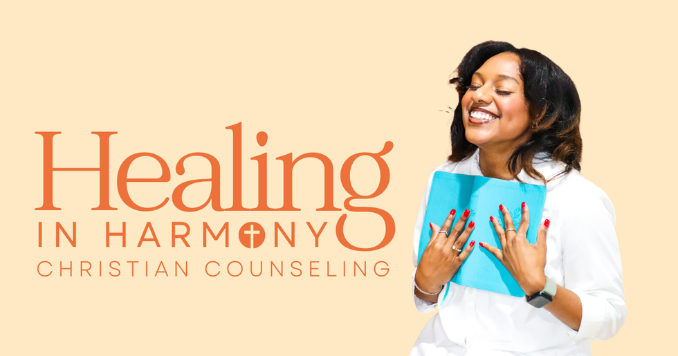
Healing in Harmony
- Jun 5
- 2 min read
For Juanita, Healing in Harmony was more than a counseling business.
It was a ministry rooted in faith, compassion, and transformation.
After years of guiding young adults through pivotal life moments as a college counselor, Juanita felt called to create a space where people could receive both practical support and Christ-centered encouragement.
She wanted her brand to reflect that same calling.
🧠 The Strategy: Turning the Mission Into a Visual Identity
Before designing anything, we started with a brand brainstorm.
The goal was to understand who Juanita is, who she serves, and how Healing in Harmony should make people feel when they first experience the brand.
Juanita described her work as a blend of Scripture, science, prayer, and practical strategies. Her clients often come to her while navigating low self-esteem, anxiety, grief, burnout, trauma, relationship challenges, identity questions, and major life transitions.
But the transformation she helps them move toward is powerful.
They begin to feel seen, affirmed, encouraged, and more grounded in who they are. They learn how past patterns may be shaping their present. They find courage to set boundaries, make positive changes, trust again, and rediscover hope in God’s promises.
So the brand could not feel cold, clinical, or overly polished.
It needed to feel like peace.
🎨 The Brand: Faith-Centered, Warm, and Grounded
When we talked through the personality of Healing in Harmony, Juanita said something that immediately shaped the direction:
“She’s me.”
That gave us the heart of the brand.
Healing in Harmony needed to feel loyal, gentle, imperfect but faithful, intellectual without being intimidating, classy but down to earth, and serious when necessary while still feeling warm and approachable.
Visually, we pulled inspiration from the things that felt personal to Juanita and aligned with her ministry:
Orange and yellow tones
Sunsets and nature
Sunflowers
Crosses
Butterflies as a symbol of transformation
Plants as a symbol of growth and seeds being planted
The final direction became soft, warm, traditional, and chic — with a modern but slightly old-fashioned feel.
From there, I created a refreshed logo and brand kit that gave Healing in Harmony a more cohesive and recognizable identity.
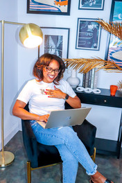
🎥 Bringing the Brand to Life
Once the brand foundation was in place, we brought it to life through a full Content Day.
Because a brand is not just a logo.
It is how people experience you across your website, social media, photos, videos, and every touchpoint in between.
During Juanita’s content day, we captured a full library of brand photos and short-form video content that matched the new direction. The goal was to create visuals that felt calm, welcoming, faith-centered, and professional — while still feeling like Juanita.
We wanted people to see her content and immediately feel a sense of warmth and trust.